Front Cover:
The 'Q' logo is red with the letter in white, which contrasts with the red behind it. The font is quite curved which makes it femenine. The main colours on the front cover depends on the artist being featured. Gorillaz is the main feautre in this issue, therefore the main colour scheme is different shades of blue. Text and text boxes are red and white, as this is the colour scheme for 'Q' magazine. The image is a cartoon, which is not often a convention used by Q magazine. There are superimposed images of different artists, who will also be featured in the magazine, in the cartoon. This shows the main artist is more important, and the smaller photographs are of lesser importance in this issue. There is not much text on the front cover, and the majority of the text is at the bottom of the page. The layout of the whole front cover is very image-dominated, and does not include much text. the text is white, which makes it easy to read against the blue background image. The language is informal and casual, 'world exclusive' and 'star studded crew set sail again'. 'set sail' light-heartedly links with the image, as the cartoon is of the sea and waves.
Contents:
The layout of the contents page is in a 'blocky' style, but is also quite image dominated. There is 3 main colours used - red, white and black, which links to the colour sceme of 'Q' magazine. There are 5 photographs, with page numbers in a large white font at the corner of each. This makes it easy for someone to notice the photograph then quickly jump to the page the article is on, instead of reading through the text. The subheadings and page numbers are in bold, and the text underneath is smaller. The text is in sections at one side of the page, with the images seperate.There is a main cartoon image of the artist, which dominates the page. The contents page as a whole, uses a mixture of conventions from both the simplistic 'blocky' style and the more image-dominated look.
Double Page Spread:
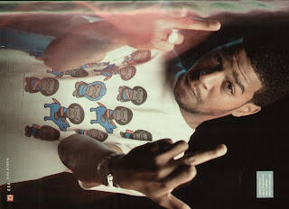
The double page spread is image-dominated, as a photograph of kid-cudi goes accross the centre line. The background of the photo is black, but the artist in the image has bright, vidid colours in his clothes and around him, which shows he is the main focus. There is not much text, and the font is small. The text is situated on the left side, and the photograph is mainly on the opposite side. The text is white, which contrasts against the black background, making it easier to read. There is a big 'K' at the beginning of the article, a convention regularly featured in 'Q' magazine. The colours and fonts are neutral. and do not specialise for a specific gender.


No comments:
Post a Comment