This week we are working on our magazines. I took some new photos for my front cover and double page spread. I took quite alot of photos but i only achieved a few good shots, which i am going to use. The images are nice because it has sunlight streaming through, like the photos which inspired me (below). In lessons and in free periods i have been editing my magazine and making sure i have done everything on my blog by using a checklist. It is the deadline week so i have been double-checking spelling, punctuation and mistakes on my magazine and correcting them before it's too late. I noticed when i printed my front cover out, that the photo quality was reduced and became grainy, therefore i was left with a dilema: do i use an old photo, or stick to the new photo because of the better composition, though with worse quality. I have had problems uploading videos to my blog too, but hopefully i will sort that out before the deadline.
Wednesday, 13 April 2011

Photograph Inspirations


I used these images as inspiration for my own photographs. The photos all have something in common - use of lighting.
The top photo is an NME front cover, with Carl Barat on the front. In the photograph, he is looking directly into the camera, which is why it is ideal for the front cover. The photo is also really bright on his facial area, because there has been lighting used to contour his face and make the whole image brighter. For my own front cover image, my model looked directly into the camera and i used lighting to brighten the image and highlight my model.
The bottom row of images are all very similar. In each, the model is gazing dreamily to the side and the lighting highlights and contours the model. In my own images, the lighting is very important, as it can make a whole image so much better with correct lighting. In my double page spread photograph, my model is gazing out of the shot, like in the above images, and the lighting is mainly on one side of the photograph, like the first image in the row.

Saturday, 9 April 2011
images
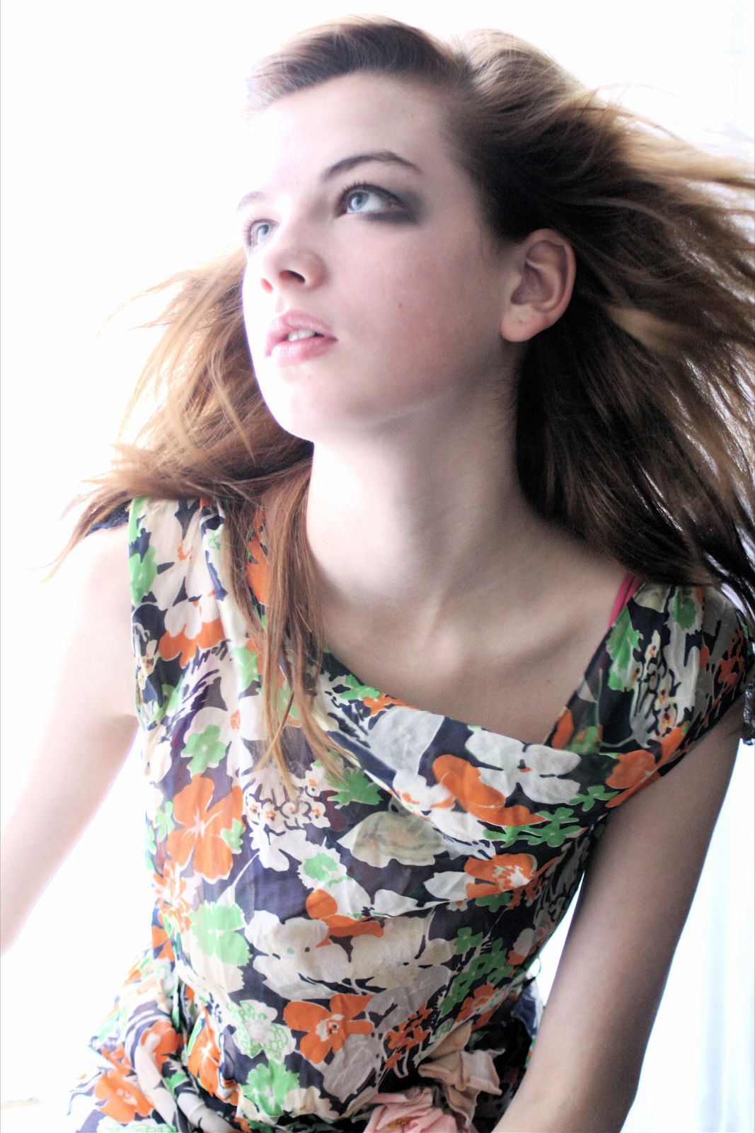
This is my favourite photo that i have taken. I took it by using natual daylight mixed with artificial light and the flash from the camera. This gave a nice effect to the picture and it is really light and nice. My model was standing against a white background and near a window with natural daylight streaming through. We used a hairdryer to make it look like her hair was blowing and i think i achieved this well. I used a professional camera (which belonged to my friends dad) to take this photo, however, for the rest of my photos i used a different camera, therefore the photos are a mixture of different qualities. I took a few different shots with this mise-en-scene, but the shot above is the best one that came out of the photoshoot, therefore i chose it for my double page spread.
On photoshop i have not edited it much, i have only made it slightly lighter by increasing the brighteness.

I took this photo by using lighting mixed with natural light and using a professtional camera, like the photo above, so i achieved a professional shot, in my opinion. The photo was taken mid-day and is very light. I am lucky i was able to borrow a professional camera and light. The photo is an extreme close-up, therefore i thought it would be suitable for the front cover. I edited the photo quite alot, but i only increased the brighteness on photoshop and slightly increased the contrast, so the light was in one corner. I like this photo because it is similar to my DPS photograph, however, the two photos are very different to the photos on my contents page, although this could be a good thing as it shows variation.

I took this photo on my original photoshoot. I did not use any lighting and just put my model against a white wall, therefore the quality of the shot was not very good. I used my own digital camera to take the photo, therefore the quality is very different to the rest of my photos, like the two above, for example. The lighting is not very good and the picture is very dark, in comparisson to my other photos. I did not use this because of that reason.

This photo was taken at night time using a digitial camera. My model was standing by a tree in the woods and it was hard to get a decent shot because it was so dark. The flash makes the focus of the picture only on the model and the tree, and the rest of the image is almost in total darkeness. I decided to keep this photo and use it in my contents page because it is very different to the rest of the images i have used, such as the above for example. The darkeness of this photo contrasts with the lightness of the photo above and the shot is from quite a long distance.
I did not edit this image on photoshop because i didn't think it needed editing because it was already extremely dark and editing it would not make much of a difference.
I did not edit this image on photoshop because i didn't think it needed editing because it was already extremely dark and editing it would not make much of a difference.


I took this photo for my contents page. My model was standing against a brick wall in an alley, though i noticed graffitti on the wall but i thought this gave quite a good look for my photos. We did not use any lighting and relied on only natural daylight. I used the school camera to take this photo and i took loads of different shots, but in the end i decided to use this one for my contents page because i like the pose and the shot. This photo is also one of my favourites in my magazine because the background is really different to all of the others i have used in my other photos, and gives variation.
On photoshop i edited this image slightly, just to make the colours more vivid and stand out. I did this by using the 'autofix' tool.


This is the photo i was using for my front cover. This shot was easy to do because i did not use any additional lighting and my model was wearing a casual outfit - a plain white t-shirt. We took the photo against a plain white wall. I used my own camera to take this shot, and the image quality is different from the other images, especially my double page spread, which was a problem. I tried to make this image more similar to the one i am using in my double page spread by editing it on photoshop to make it lighter and brighter.
On photoshop i increased the brighteness and contrast and cut out some of the background to make it plain white. I used the clone stamp tool to get rid of spots and patches of light on the skin. I did not acheive my desired result and i think the final image looks 'over edited' and is too obviously photoshopped, which you would not see in a professional magazine, such as my style model 'Q'.
Tuesday, 5 April 2011
Diary week 6
This week we are continuing with editing our magazines. We analysed each others first drafts of our magazines and gave feedback to people and I received feedback for my own magazine, from students in the class and our teachers. We wrote what we liked about them, and listed what they could change. After receiving my feedback, I listed all of the changes, which included changing fonts and adding more text into the contents page to fill blank space, and I am going to take them on board.
Thursday, 31 March 2011
Rough Cut Teacher Feedback
Front cover- The title of the magazine needs to go at the side and be bigger. There is also little text on the front cover, so more text in the bare spaces would make it better.
Contents Page- There needs to be more information on the contents page. There is a picture with a page number underneath, but it dosen't say who the artist is. Write about what the picture is representing (which story/artist).
DPS- The columns need to be equal and bigger text for the title. I need to write the name of the artist who the article is about on the page.
Contents Page- There needs to be more information on the contents page. There is a picture with a page number underneath, but it dosen't say who the artist is. Write about what the picture is representing (which story/artist).
DPS- The columns need to be equal and bigger text for the title. I need to write the name of the artist who the article is about on the page.
Rough Cut Student Feedback
What did you like about my project at this stage?
My feedback from students said that they liked the strong images used on the front cover and in the contents page. The colour scheme was said to be consistent and works well. The layout and structure is good and well laid out in the contents page.
What could be improved?
The barcode has no numbers and the date on the front cover is on twice, by the title and by the bar code. The contents page could have a page number and could have more images. In my Double Page Spread, a bit of space could have been filled and the line could be removed. Most of my feedback also said my magazine title 'remix' could stand out more. Some of my feedback said that the font does not stand out, therefore a different font would be easier to understand. In the Double Page Spread, put a page number on the left page.
What have i learned?
I am going to remove the date from the top of the page and place it at the bottom corner of the pace, next to the barcode. I am going to do this because people have noticed i had put the date on twice. I am also going to put a white box around the barcode to make it stand out more and be read clearly. Another main thing i am going to change, is the text in the double page spread. In the DPS, people have noticed there is alot of bare space which should be filled. I am going to add more text and straighten it out so it looks neat and fills blank space. On the front cover, i am going to change the font and colour of the text, to make it easier to read. This is because people commented on the front cover saying the text was not clear to read. Overall, the main things i am going to change is the text, to make it easier to read and to cover space.
My feedback from students said that they liked the strong images used on the front cover and in the contents page. The colour scheme was said to be consistent and works well. The layout and structure is good and well laid out in the contents page.
What could be improved?
The barcode has no numbers and the date on the front cover is on twice, by the title and by the bar code. The contents page could have a page number and could have more images. In my Double Page Spread, a bit of space could have been filled and the line could be removed. Most of my feedback also said my magazine title 'remix' could stand out more. Some of my feedback said that the font does not stand out, therefore a different font would be easier to understand. In the Double Page Spread, put a page number on the left page.
What have i learned?
I am going to remove the date from the top of the page and place it at the bottom corner of the pace, next to the barcode. I am going to do this because people have noticed i had put the date on twice. I am also going to put a white box around the barcode to make it stand out more and be read clearly. Another main thing i am going to change, is the text in the double page spread. In the DPS, people have noticed there is alot of bare space which should be filled. I am going to add more text and straighten it out so it looks neat and fills blank space. On the front cover, i am going to change the font and colour of the text, to make it easier to read. This is because people commented on the front cover saying the text was not clear to read. Overall, the main things i am going to change is the text, to make it easier to read and to cover space.
Subscribe to:
Posts (Atom)